Chart your course
How to Read a Marine Weather Map
Quick answer
The short version
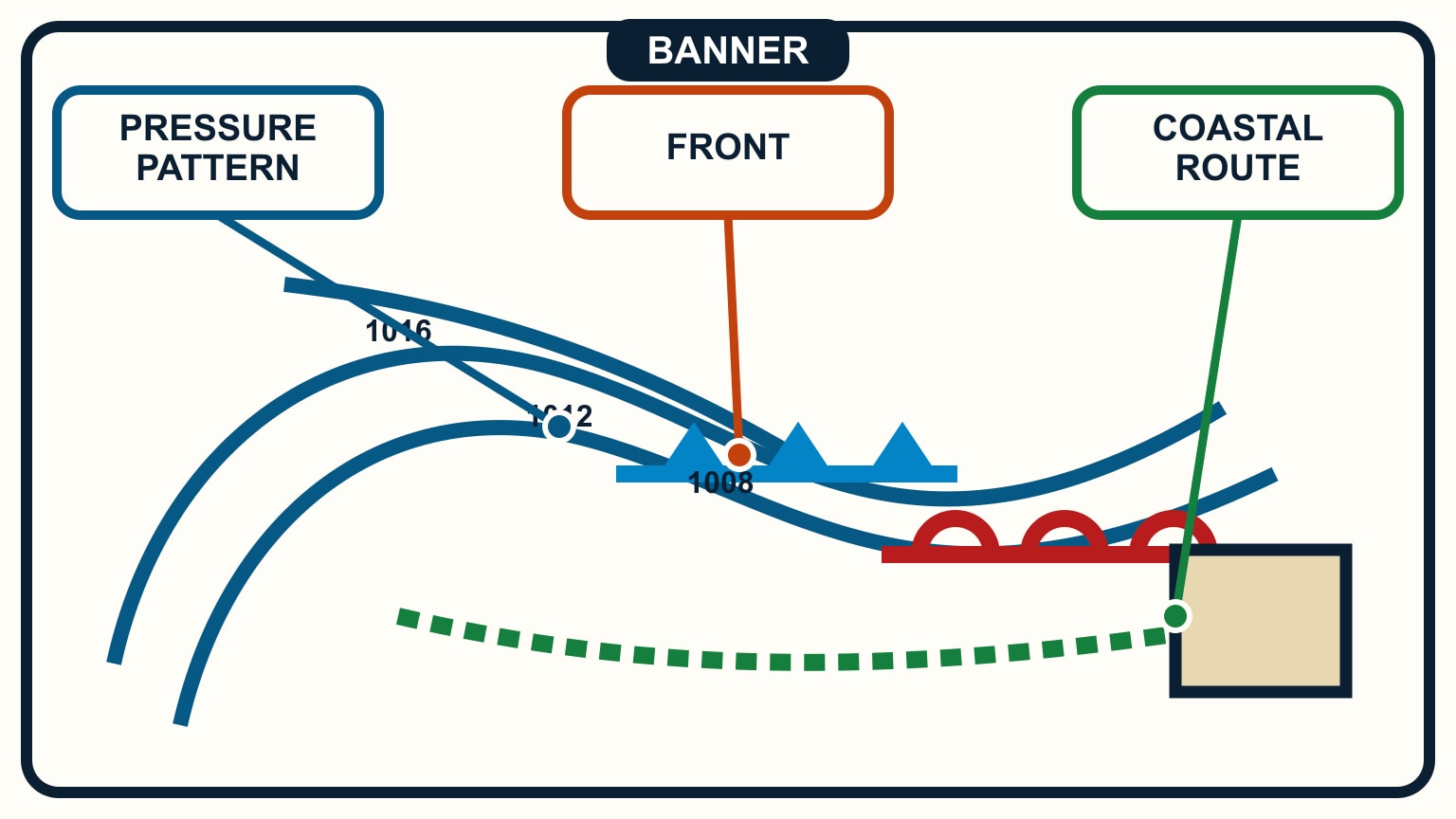
A marine weather map gives the written forecast a shape. Isobars show the pressure pattern. Front symbols show analysed or forecast boundaries between air masses. Highs, lows, troughs, and their movement help explain why the wind and weather may change. The map is not a stand-alone departure signal, however. Read it beside the current official marine forecast and warnings for your sea area.
Beginners often jump straight to the nearest front. A better sequence starts at the edge of the page: source, issue time, valid time, units, and whether the chart is an analysis or forecast. Only then should you interpret the symbols. Finish by asking what the pattern means for the actual route, including the last safe opportunity to wait or turn back.
If the words in a bulletin are still unfamiliar, work through how to read a marine forecast first. The map should clarify the bulletin, not replace it.
Start with source, chart type, and valid time
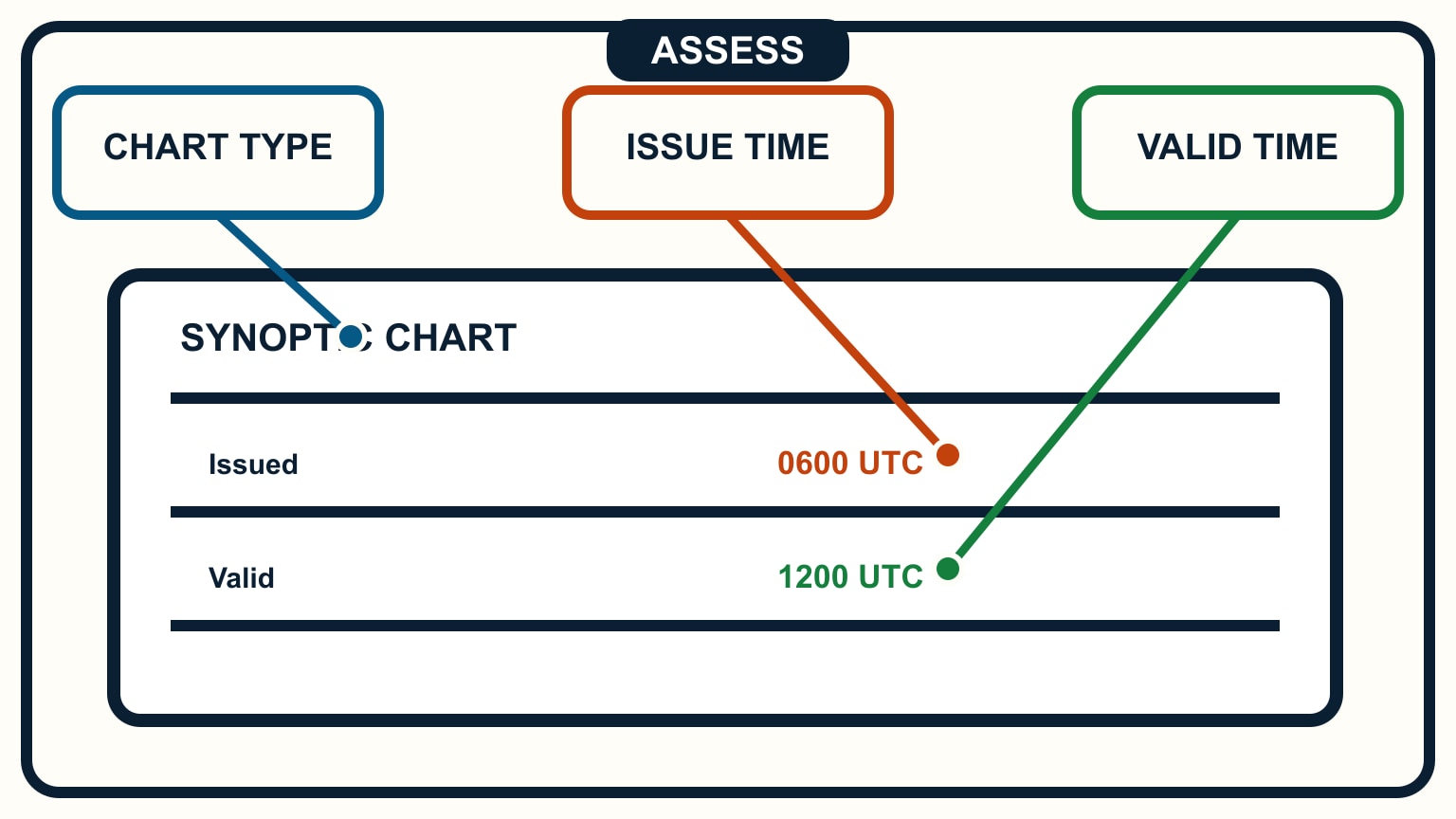
Confirm that the chart comes from the official or otherwise trusted service you intended to use. Screenshots lose context quickly, and social posts may circulate an old chart long after its valid period. Use the publisher's current page when possible.
Next identify the chart type. An analysis represents the service's assessed state of the atmosphere at a stated time. A forecast chart represents the predicted pattern at a future valid time. It is possible for both to be issued at about the same moment, so the word “latest” alone does not tell you which one you are viewing.
Find the issue time and the valid time, then note the time zone. The valid time is the point in the weather story shown on that sheet. When a front appears near the route, compare the charts before and after it rather than treating one frame as a complete sequence. Write the relevant times in the same convention used by the passage plan.
Read the legend. Pressure may be labelled in hectopascals or millibars, which are numerically equivalent in this context, but interval and symbol conventions can vary by publisher. Forecast-chart confidence and update schedules also vary. Do not import a timing assumption learned from one service into another chart.
Finally, locate the voyage rather than only the departure harbour. Weather approaching from outside the cropped route can matter more than the symbol directly above the boat. A wide view establishes the system; a closer view helps connect it to headlands, exposed legs, and shelter.
Use isobars to see the pressure pattern
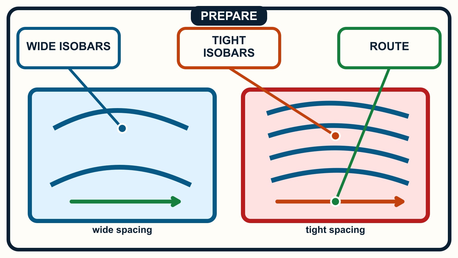
An isobar joins places of equal mean sea-level pressure. The labels tell you the pressure value; the shape and spacing reveal the larger pattern. Closed curves around a low or high help locate pressure centres. Elongated bends may point toward ridges or troughs, depending on the service's conventions and the surrounding field.
Closer isobar spacing indicates a stronger horizontal pressure gradient than wider spacing on the same chart. That commonly supports stronger wind, but it is not a direct cockpit wind gauge. Surface friction, land shape, stability, local heating, and the movement of the system all affect the wind a boat experiences. Use the official marine forecast for the operational wind wording.
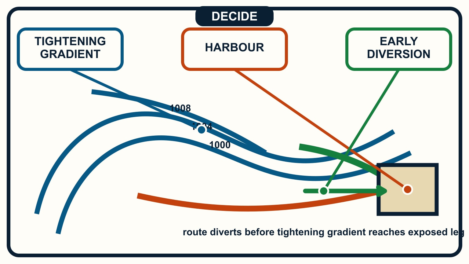
Trace several isobars, not just the one nearest the boat. Are they broadly parallel across the route, turning sharply, or bunching toward a low? Does the next forecast chart show the gradient tightening or relaxing? That change can matter more than the current value printed at one point.
Avoid trying to calculate an exact wind from visual spacing. Chart projection and scale affect the apparent distance, and publishers may use different pressure intervals. A useful beginner conclusion is comparative: “the gradient is tighter on the exposed second leg and tighter again on the later chart.” Pair that with the forecast range and the boat's limits.
A high-pressure centre also does not promise uniformly gentle conditions, and a low does not tell you the precise wind at the marina. The route may sit well away from the centre or beneath a locally modified flow. The map describes the synoptic pattern, not every channel and cove.
Read fronts as moving boundaries
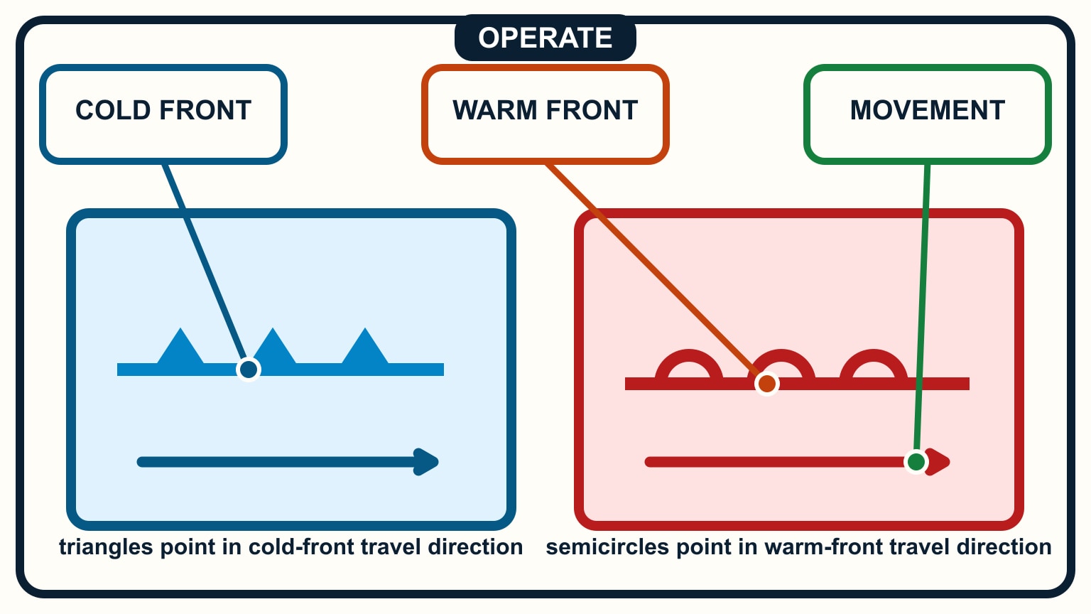
On the common convention, a cold front is drawn with triangles and a warm front with semicircles. The symbols point in the front's direction of movement. An occluded front combines the symbols on the same side of the line; a stationary front places them on opposite sides. Check the chart legend rather than relying on memory alone.
The line is not a wall of identical weather. It marks an analysed or forecast boundary, and associated cloud, rain, visibility changes, gusts, or wind shifts can extend away from it. The official bulletin explains which effects the service expects in the marine area. A front drawn just beyond the route may therefore still affect the passage window.
Follow the feature across successive valid times. Estimate when it approaches the broad sailing area, then compare that story with the written timing phrases. Do not claim minute-level arrival precision from a synoptic chart. Front speed and structure can change, and a four- or six-hour chart interval leaves room between frames.
Look at the pressure pattern on both sides. A front paired with tightening isobars tells a different planning story from a weakening boundary in a slack gradient. Troughs, often shown with their own line convention, can also organise showers or wind changes without the familiar cold- or warm-front marks.
If thunderstorms or squalls are possible, the front symbol alone is not enough. Consult the relevant warning and convective information, and review how to recognise storm clouds and squalls. Local observation remains essential.
Turn the chart into a route briefing
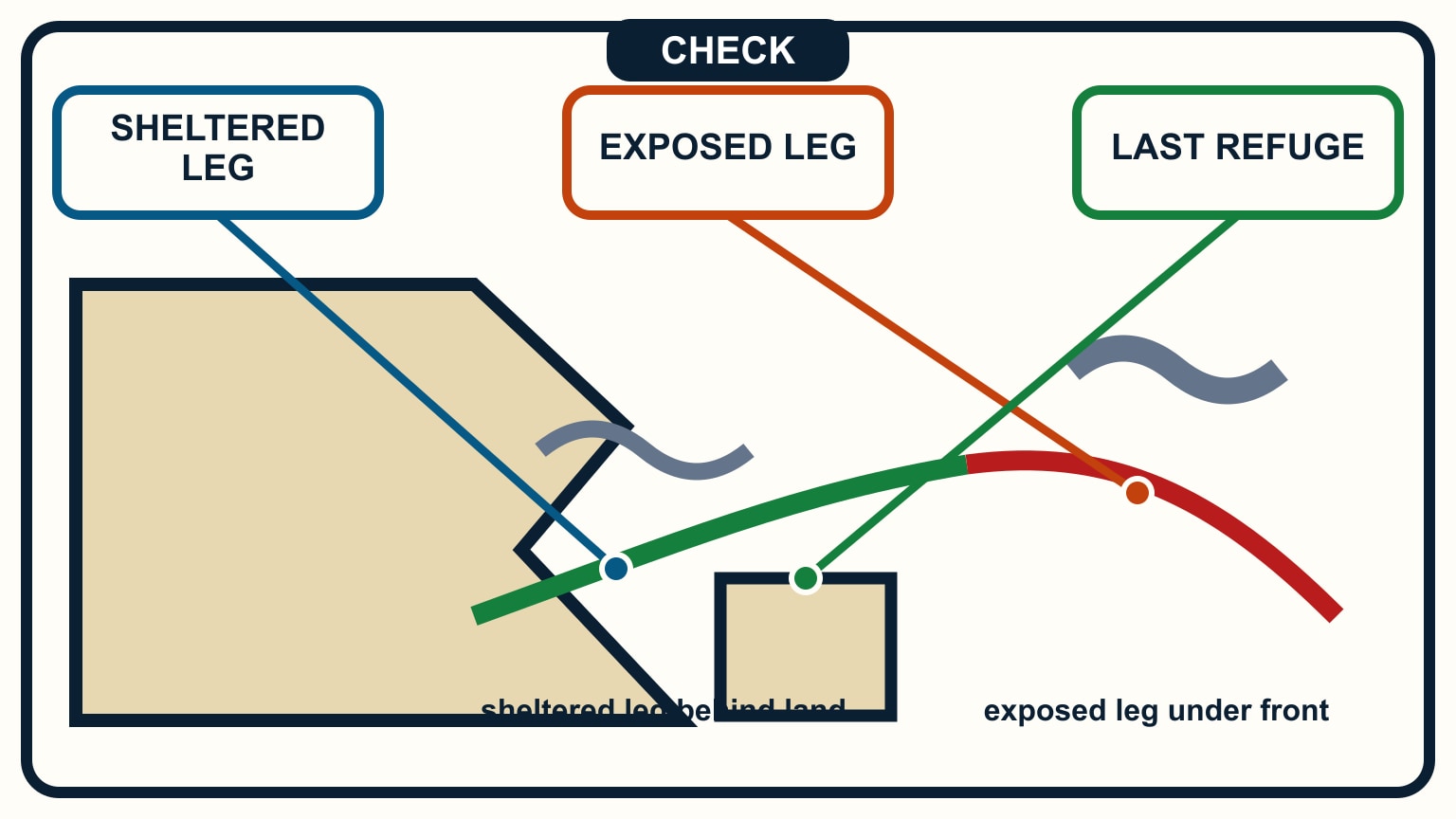
Translate the regional pattern into five route questions:
- What feature is controlling the weather now?
- What is expected to move or strengthen during the passage?
- Which leg is most exposed to the forecast direction and sea state?
- Where is the last straightforward shelter before that leg?
- What observation or update would cancel the plan?
Then read the current official forecast and warnings aloud. Mark every mismatch between the chart story and the bulletin. The map may make the sequence clearer, but the bulletin may contain localised hazards, visibility, sea state, or warning criteria that cannot be recovered from isobars.
Add recent observations. Compare pressure trend, wind, cloud, visibility, and available station or buoy reports with the analysed pattern. If the expected feature is arriving earlier at upstream locations, assume the comfortable timetable may shrink. If observations do not fit the map, seek an updated product rather than forcing them into the planned story.
Keep the briefing proportional. A short coastal sail may need only the controlling feature, expected change, warning status, and fallback. A longer passage needs update times and decision points. In either case, every crew member should understand what “worse than forecast” will look like without needing to decode the chart at sea.
GRIB files can add another view of timing and spatial detail, but they do not turn the map into a certainty. Use GRIB files versus marine forecasts to assign those products separate jobs.
Update the plan before the easy options disappear
Weather maps age. Check the service's publication schedule and obtain the next chart and bulletin while communications are reliable. Confirm the valid time again after every download. A familiar-looking pressure pattern can hide that the screen is still showing the previous cycle.
Reassess at decision points chosen ashore: departure, the last nearby refuge, the start of an exposed leg, or the approach to a constrained harbour. Compare the updated chart, bulletin, warnings, and observations. If the feature is faster, stronger, or less certain than planned, preserve room by waiting or shortening the route.
Do not wait for every source to agree that conditions have become unsafe. An official warning, an exceeded boat limit, deteriorating visibility, unexpectedly rising wind, or an unwell crew member can each be enough to stop. The safest map-reading skill is recognising when the original plan has lost its support.
Save one analysis and forecast chart after an ordinary day sail, along with brief observations. Later, trace what moved and what did not. That practice builds pattern recognition without putting pressure on a live decision.
A weather map is most useful when it changes a choice early. Put its valid time, controlling feature, expected change, and fallback beside the weather check in your float plan, and leave the dock only while the whole story remains workable.
Try it from the lesson
Can you spot the next move?
Your weather app, opened this morning, shows calm conditions. It's now mid-afternoon and you're about to leave. What should you check first?
Why you can trust this guide
. We build each guide from public seamanship and safety sources, then teach the universal principle before any local difference.