Chart your course
The Map That Floats: Reading a Nautical Chart
Quick answer
The short version
To read a nautical chart, start in its corner: check the scale, the depth units (meters, feet, or fathoms, the chart tells you which), and the datum note before you trust a single number on it. Positions are fixed by latitude and longitude, and the rule that makes a chart usable for distance is that one minute of latitude equals one nautical mile, measured on the latitude scale running up the side of the chart nearest your position, never on the longitude scale along the top. Depths, called soundings, are the numbers scattered across the water; depth contours connect equal soundings into a shape you can read at a glance, and a small abbreviation beside a sounding tells you what the seabed is made of. Rocks, wrecks, and obstructions carry their own symbols, decoded by the chart's own symbol legend.
A road map gets you from one town to the next. A nautical chart does something different: it shows you what's under the boat. Alongside the coastline, a chart carries water depth, the shape of the seabed, marked hazards, and the aids to navigation (buoys, lights, beacons) that a sailor uses to fix a position offshore, none of which a road map has any reason to include. The first time you unfold one, the sheer density of numbers and symbols can feel like a different language. It isn't, once you know where to look: a handful of habits (reading the title block, using the latitude scale for distance, and treating soundings and symbols as information rather than decoration) turn a chart from clutter into a genuinely useful tool.
Read the Title Block Before Anything Else
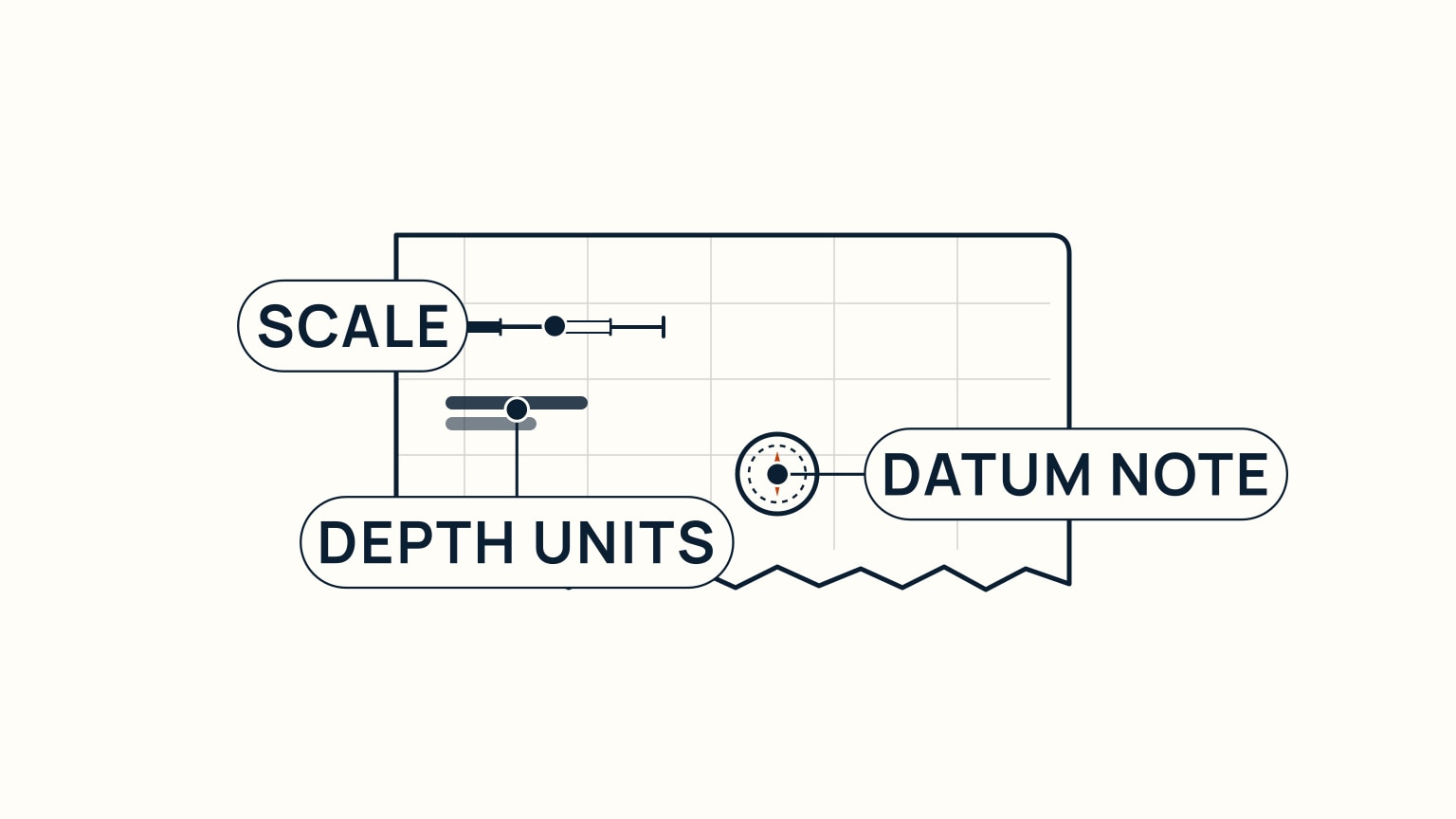
Every chart's title block is where it tells you how to trust it, and it's worth reading before anything else on the sheet. The scale is the ratio between a distance on the paper and that same distance in the real world: a larger-scale chart shows a smaller area in more detail, which is what you want close to shore, while a smaller-scale chart covers a wider area on the same size sheet, with less detail packed into it. The depth units matter just as much: soundings are printed in either feet or fathoms (a fathom is six feet), and while most charts worldwide now use metres, plenty of older charts still don't. The chart states which, so you check every time rather than assuming it matches the last one you used. The datum note tells you the reference level those depths are measured from: many charts reference it to the lowest tide the area is expected to see, while some non-tidal waters use mean sea level instead.
Get in the habit of reading all three before you plan anything from a chart. A course, a depth check, or an anchoring spot is only as good as the units and reference you read it against.
Measure Distance on the Latitude Scale
A position on a chart is fixed by latitude (how far north or south of the equator) and longitude (how far east or west of a reference meridian), each given in degrees and minutes. Latitude does something extra useful: one minute of latitude equals one nautical mile, a relationship going back to the nautical mile's original definition as the meridian-arc distance covered by one minute of latitude. It isn't perfectly identical everywhere. A minute of latitude runs slightly longer near the poles than at the equator, since the Earth is an oblate spheroid rather than a true sphere, but it stays close enough to use directly at chart scale.
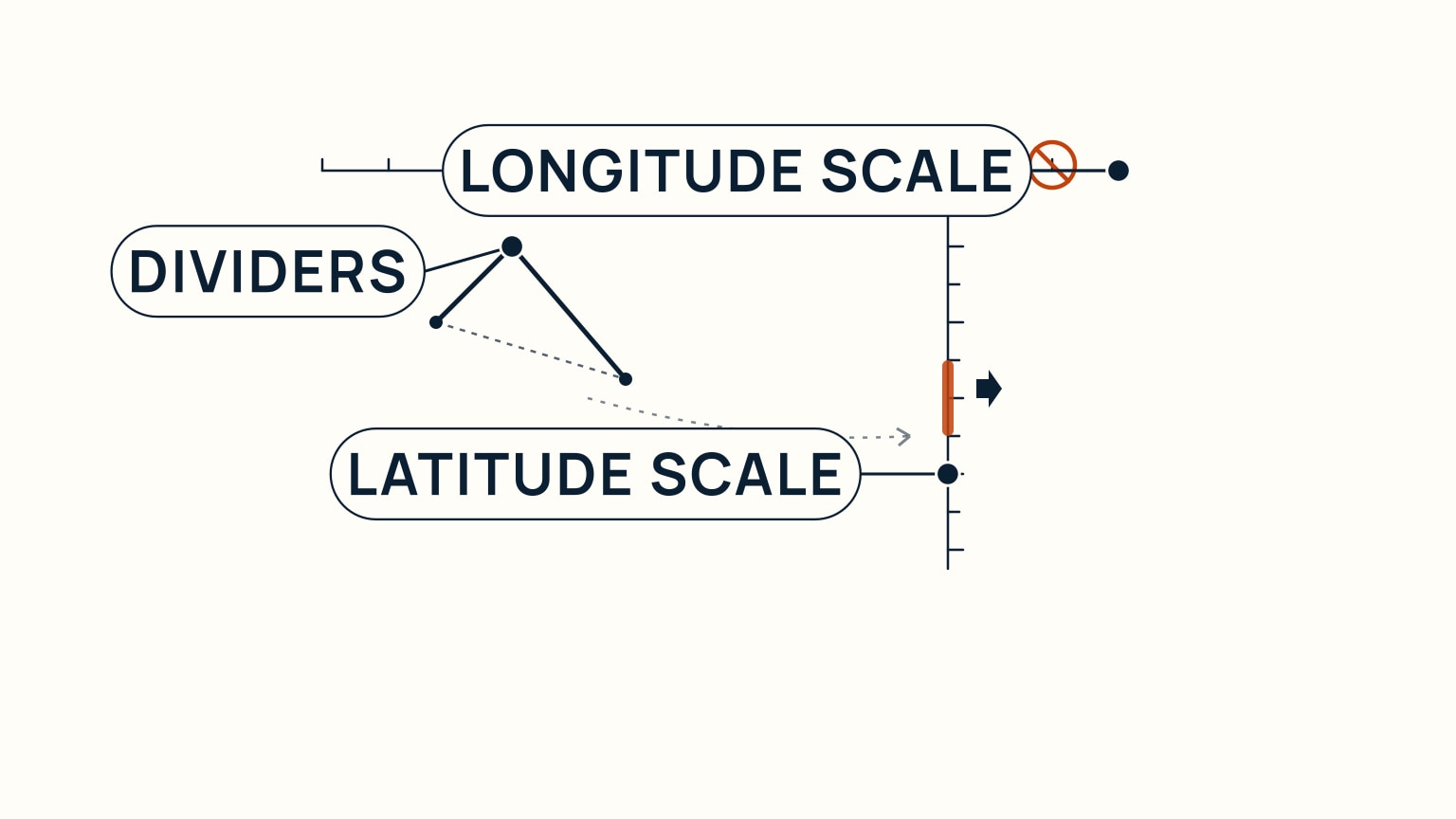
That's why you measure distance on the latitude scale, the vertical scale running up the side of the chart, and not on the longitude scale along the top or bottom. The longitude scale doesn't share that one-minute-equals-one-mile relationship, so a measurement carried there comes out wrong. Walk a pair of dividers between two points on the chart, then carry that same span to the latitude scale beside your own position (its spacing can shift slightly elsewhere on the sheet) and read the number of minutes off directly as nautical miles.
Read Soundings, Contours, and the Seabed
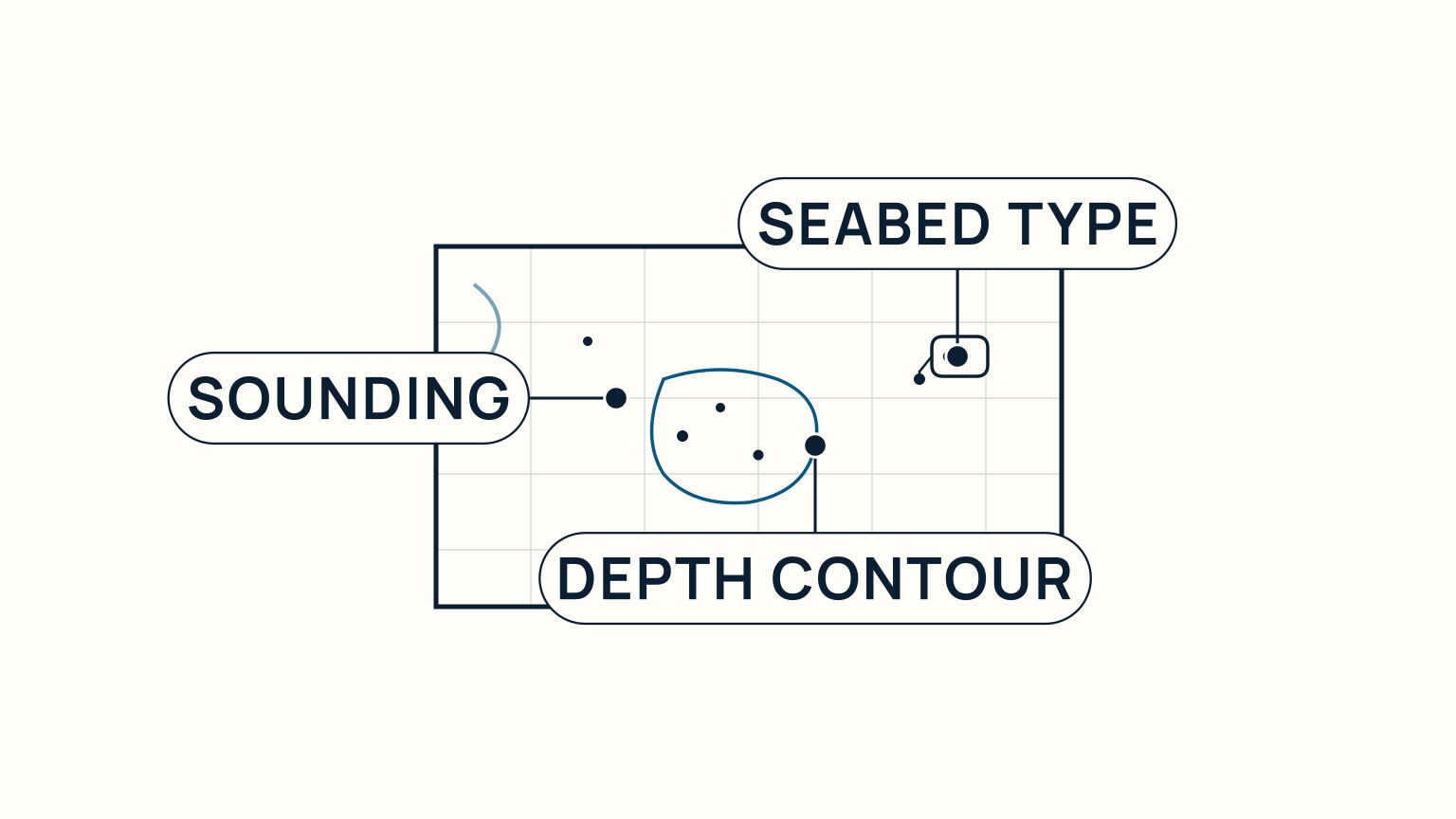
The numbers scattered across the water on a chart are soundings: individual depth measurements, each tied back to the chart's datum. On their own they're just a scatter of digits; connect the ones of equal depth and you get a depth contour, a line that traces the shape of the seafloor the same way a contour line traces a hill on a land map. Read a few contours together and you can see a channel, a shoal, or a shelf coming well before your own eyes or a depth sounder would tell you in the moment.
Look closely beside a sounding and you'll often find a small abbreviation too, describing what the seabed there is actually made of: sand, mud, rock, and so on. It's easy to skim past, but it matters most exactly when you need to anchor: a lightweight anchor bites well into hard sand or mud and struggles in soft mud or rock, while a plow-shaped anchor holds across a wider range of bottoms but does poorly in soft ground. Reading that seabed abbreviation before you drop the hook is exactly the habit anchoring itself depends on: the chart is telling you what your anchor is about to grab.
Decode Hazard Symbols and Check the Chart's Currency
Use the chart as a route conversation
Before departure, trace the route from berth to destination at the scales that show the needed detail. At each leg, say the expected depths, nearby hazards, aids to navigation, clearing features, and the next safe water. This turns symbols into decisions instead of leaving the chart as a background map.
Mark where the plan needs another source: tide or current information, local notices, sailing directions, harbor instructions, weather, or current chart corrections. A chart's title block, edition, datum, units, and notes tell you how to interpret it. They do not prove that an old copy contains every recent change.
During the trip, compare the chart with position, depth, and the view outside. If a buoy, shoreline, or sounding differs from expectation, slow down in safe water and resolve the discrepancy. The chartplotter versus tablet guide covers electronic-display limits, while understanding tide tables helps turn charted depth into expected water depth.
Use latitude scale for distance rather than measuring against longitude. Read soundings with their units and datum, follow contours to understand the shape of shallow water, and give isolated symbols enough room. A route line passing between two printed hazards is not evidence that the real boat fits there with safe clearance.
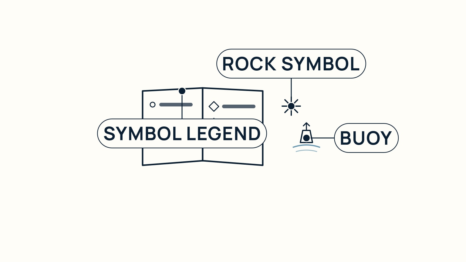
Rocks, wrecks, and obstructions each carry their own chart symbol, and the exact symbol used carries information too: a rock that covers and uncovers with the tide is marked differently from one that's always underwater, and an obstruction confirmed by a diver or a wire drag gets a different symbol from one whose depth is only an estimate from a single sounding. You don't have to memorize every variant. Every hydrographic office publishes an official symbol legend for its own charts (often called something like "Chart No. 1"), and mariners are expected to keep the relevant edition alongside their charts rather than guess. Buoys get the same treatment: their charted symbol encodes a colour and a letter code for the buoy type, decoded the same way, through the legend rather than memory.
Charts themselves come from official hydrographic offices, published in both paper and electronic form, and they age the moment they're printed. New hazards get discovered, buoys get moved, and surveys get redone, so every agency issues ongoing corrections (notices, update files, revised editions) to keep a chart current. Before you trust an old chart, or one you're not sure has been corrected, check its currency the same way you'd check anything else that goes out of date. A chart is a snapshot, not a guarantee.
Reading a chart well is less about memorizing symbols than building the right habits: check the title block first, measure distance on the latitude scale, and treat soundings, contours, and symbols as real information rather than decoration on the page. None of it is hard once you've done it a few times: it just takes doing it, ideally with a real chart in front of you rather than a description of one.
That's exactly what SailStarter's lessons are built around: working through a real chart step by step, alongside the rest of what it takes to navigate and handle a boat with confidence. If a chart still feels like a foreign language, that's the fastest way to make it click.
Try it from the lesson
Can you spot the next move?
On a NOAA paper chart, you see buff, green, and blue close to shore. What does each colour mean?
Why you can trust this guide
. We build each guide from public seamanship and safety sources, then teach the universal principle before any local difference.